Drifting through the Archive
Finding stories that matter to designers
The PGDA is an easy-to-use resource that gives more people a voice in deciding what is important to graphic design history. It’s exciting to see how many students are using it. I think it’s a fun starting point for following one’s curiosities. In combination with other research methods — such as doing a literature review, visiting physical archives (when possible) for direct observation of materials, and triangulating facts by checking multiple sources — the PGDA can support researchers in creating new knowledge in our discipline. I wrote a whole book about how designers can engage with history, and resources like PGDA are a boon to those who may not have access to institutional collections. By learning to do historical research, designers can find the stories that matter to them and best pertain to their work. And, by carefully tracking and citing our sources, we can help others do research too.
Thinking through Graphic Design History, Aggie's latest book from Bloomsbury
Some favorites from The People's Graphic Design Archive
Valmor ad paste up by Charles Dawson
I wanted to start my “drift” through the PGDA with an entry that would speak about labor. Before the computer, designers prepared “paste ups” or “mechanicals” as final art for production. These were thick paper boards onto which they adhered illustrations, typography, and other graphic elements. This example, made around 1935, was created by Charles Dawson for Valmor Products. It advertises “Good Luck” perfume and sachet powder, along with a promotion in which customers could pick up an “alleged good luck coin” for free with purchase. Valmor was known for producing skin-lightening creams, hair straighteners, and other cosmetics intended for African American consumers. From this digital image, we can see that Dawson integrated several spot illustrations into a composition crowned by custom lettering. There are pencil marks throughout and a number of brown rubber cement stains.
After trying to locate the paste up at a few Chicago-based institutions, I learned that it is held in the private collection of Tim Samuelson, who kindly answered my questions about it. According to him, Valmor kept a file of drawings by Dawson for use in various layouts. It was common to remove art from one paste up and reuse it in another (hence, the brown stains). The entry lists a reference to an article on Design Observer, which shows the paste up in the exhibition Love for Sale: the Graphic Art of Valmor Products at the Chicago Cultural Center. My colleague and friend Chris Dingwall wrote a review of this exhibition for Design Issues, in which he also discussed Dawson’s deliberate representation of “pleasing Negro types” (African Americans with light skin and slick hair) for Valmor. This marketing strategy may be difficult to accept from the vantage point of the present. Yet this is one of the reasons why history is so valuable: artifacts from the past are windows into complex worlds in which people sometimes held different values than are common today.
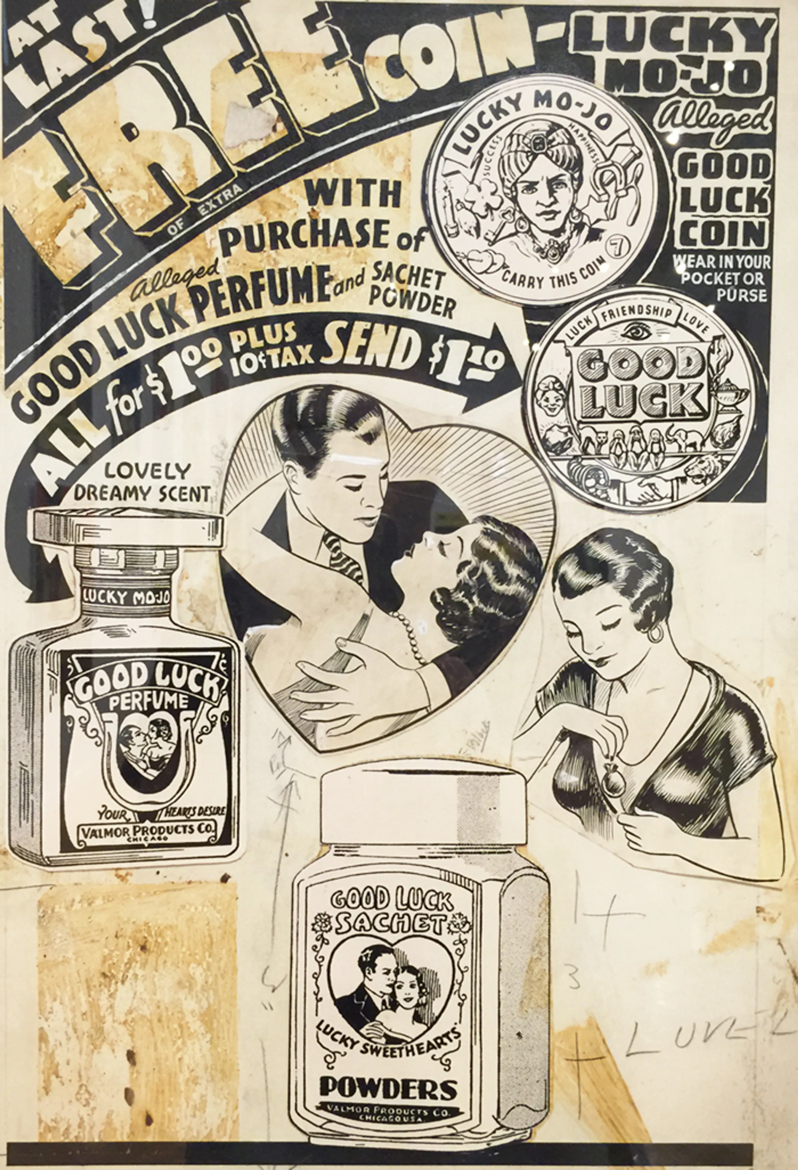
Original paste up for advertising, exhibiting good luck coins and perfume. Art by Charles Dawson.
Macintosh Test Drive brochure cover, 1984 archived by Anne Brown.
After looking at Dawson’s paste up, I wanted to see examples of advertisements for the Apple Macintosh, which came out in 1984. The Macintosh transformed the way graphic designers work. I wondered what kind of language was used to sell this technology (and if we might hear resonance in AI rhetoric). I stumbled upon this “Test Drive” promotion in which consumers could borrow a Macintosh from a retailer, use it for 24 hours, and then decide whether or not to keep it. The entry shows the cover of a 16-pg instructional manual that trained the uninitiated consumer on how to use the Macintosh. Wanting to learn more, I found scans of the interior on Mac Mothership, a digital archive of ads for early Apple computers. The booklet impresses upon the reader that by using the Macintosh, their work will become easier. Its five pre-loaded applications will help the user write, draw, plan, and even automate tasks like turning tabular data into pie charts. It ends with the question, “When was the last time you had so much fun getting so much work done?” Over time, computers would make a number of graphic communication trades obsolete and designers would assume new tasks into their workload. It’s debatable that this technology has made work easier, but it certainly has changed what work is.
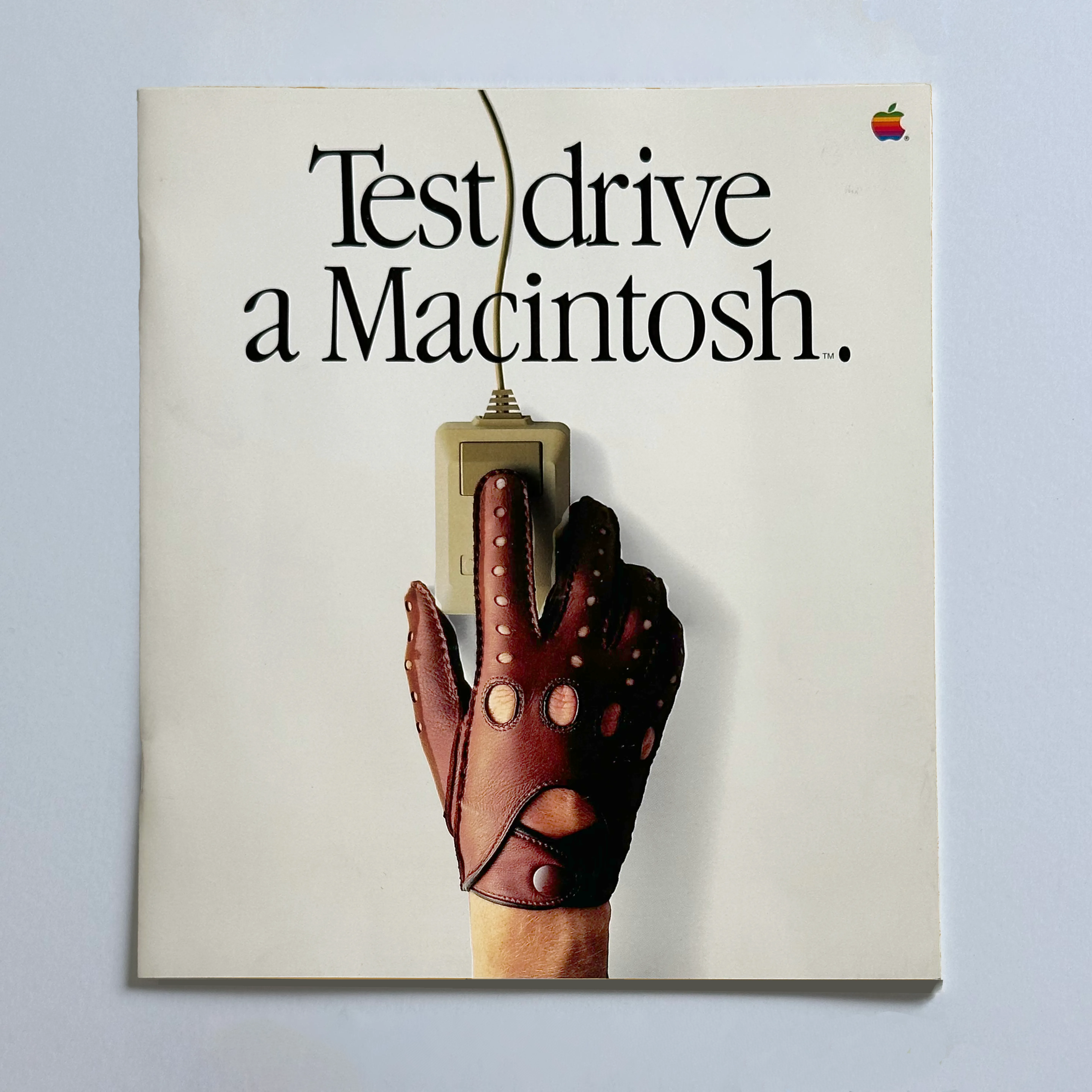
Macintosh Test Drive Brochure Cover, 1984. archived by Anne Brown
1984 Olympic Signage by Sussman-Prejza.
After reading about the Macintosh promotion, I wanted to see if I could find images of people using graphic design. I thought that a search for Olympic signage might be a good start, and I was delighted to find this example, the source of which is the Claremont Colleges Digital Library. The branding and signage for the 1984 Olympics Games were designed by Sussman Prejza and I just love the vibrant color scheme and bold patterns. You can see more images on this post from AGI. According to Wikipedia, architect Jon Jerde referred to the style as “Festive Federalist,” which made me chuckle. The design combines a sun-soaked aesthetic — so California and so New Wave — with references to the stars and stripes of the US flag. From the PGDA entry, we can observe the scale and the materiality of the signs. This article on Hyperallergic shows the use of inflatables at the opening ceremony and in placemaking installations. All of this made me wonder: what did it feel like to be at the 1984 Olympics? This news story from the Washington Post discusses the way the 1984 Games rejuvenated public interest in the Olympics. And then I remembered: it was during the 1984 Olympics when a four-year-old Aggie, pretending to be Mary Lou Retton by attempting gymnastics on our living room couch, got her first scar — 11 stitches through the center of my left eyebrow. Let’s just say I didn’t quite stick the landing.

1984 Olympics signage designed by Sussman-Prejza
Embroidery Graphics from 1770 archived by Gregory Scott Angel
After recollecting on my childhood mishaps, I did a quick search for “stitches,” and this artifact piqued my interest. It is an excerpt from an eighteenth-century French instructional manual on fine embroidery written by Charles Germain de Saint-Aubin. According to the author of this entry, the illustrations were as important as the text — they were so clear that they could be read by non-literate craftspeople. At the top of the image, we see a picture of labor in action. I’m very interested in the intertwining histories of craft, labor, and design because that’s where we often find women and working class people. I wanted to see more of the book and found the whole thing on the Internet Archive. There are 50 pages of text before we get to the illustrations. The text emphasizes that design (drawing) is the foundation of embroidery. It briefly touches on the history of the craft and cultural differences in approach. There’s also a glossary. Then, there are numerous graphic illustrations related to the trade. I wondered who the intended reader was, and what their lives were like. In under five minutes, I found this PhD thesis by Tabitha Baker which discusses the embroidery trade in 18th century Paris and Lyon. From her study, I gather that embroidery workers were likely middle class artisans whose clientele were members of the nobility. The Met offers some information too. Saint-Aubin’s book was published at a time when consumerism was on the rise, production was moving from small to mass scale, and fashion was becoming important to all levels of society. There’s a lot to dig into here. I may have to pin this for later.
Embroidery Graphics from 1770 archived by Gregory Scott Angel
From the previous entry about the embroidery book, I clicked on “process” to see what else would come up. I was attracted to these charming collages by Grace Waldo Clements. I have never seen these before. I am just beginning a research project pertaining to collage in graphic design and illustration. I’d love to examine these in real life so I can learn more about their construction. They appear to be in the collection at the Wolfsonian (thanks to Louise Sandhaus’s citation). At the time of this writing, the archive’s site wasn’t fully loading, but based on the PGDA entry, these collages were designs for a mural series in a Western Airlines coffee shop. I’d love to know if these murals came to fruition and what they may have looked like in context. In terms of form, I’m drawn to Clements’s use of intertwining shapes and the shifting figure/ground relationships within the main image, which appears to be mounted on balsa wood. I wonder how she sourced her materials. My own collage work shares visual traits with these, and I too am starting to move from the page to large-scale installations. Selfishly, I’d love to know more about how Clements made these translations, in terms of scale and materiality.
“Aviation Yesterday” mural design for Western Airlines coffee shop, 1945
What's Missing from Graphic Design History?
Traditional graphic design histories tend to foreground individual designers, as if their talent and intentions were the foremost driver of change. Without disparaging a designer’s need to have creative forebears, what I think is really missing in graphic design history is an emphasis on social structure, those patterns in society from which design emerges and which condition the actions of individuals. The emphasis on professional designers and their supposed agency — even if we expand the roster to the greatest possible extent — does not adequately explain how design has changed over time. That’s why I’m interested in social histories of design: stories about design in everyday life, stories about work, stories about everyday people making and using things, stories about design’s impact on people and places.
What do you want to add to The Archive?
Our professional organizations have not always done a great job at archiving published discourse, but these are valuable sources that show us how designers responded to evolving issues in the field. I’m interested in what designers debated around the time that the term “graphic design” began to replace “commercial art,” for example, and what they talked about when the word “canon” first emerged. Recently, I added scans of a few AIGA Journal articles, and I know others have added design writing to the archive as well.
I’d like to see more examples of process work — paste ups, sketches, models, prototypes, correspondence, etc. — so that researchers can access information about what it has meant, historically, to actually do the work. It can be hard to find examples of this — but it would be so great to see more evidence of reception: how design was used or thought about in its time. The role of consumers and audiences is such an important part of the story.