Value(s) Added: Amplifying The PGDA
From the editors: Submitting material to the Archive is an act of generosity. It takes time, and hopefully, it shows care—care for building a more diverse and expansive graphic design history. We’re often asked how we curate material added to the site. The bottom line is that, as a democratized archive, we don’t. Occasionally, we are uncertain how the submitted work might be considered graphic design. If that’s the case, the moderator will reach out to the submitter for their views.
Now and then, a work is added that makes us wonder what makes something preservation-worthy. Contemplating that question is this thoughtful and elegant essay by Susan Yelavich. It invites this community to share their finds and, most significantly, their reasoning for adding items to PGDA.
--
Does it make sense to talk about justifying submissions to an archive as radically inclusive as The People’s Graphic Design Archive? Would asking us to explain our choices contradict PGDA’s deliberately messy democratic nature, where all posts are created equal?
At a time when democracies around the world are literally under siege, invoking such egalitarian ideals may seem grossly disproportionate—or worse, callously flip. It would be if it were not for the fact that an archive identified as the “People’s” unquestionably has politics. It follows that if we understand ‘politics’ as deciding how to make decisions for groups, then every upload is a decision made for the PGDA’s constituency.
The decision to submit something to the Archive is made privately with some deliberation: Of all the possibilities available, I identify a work I am drawn to. ... Recognizing that state of mysterious attraction can lead to a better understanding of oneself. It can help cultivate a sensibility. ... But it’s not so fine for a community, even one as loose as PGDA’s, whose plurality invokes not “I” but “we.”
The decision to submit something to the Archive is made privately with some deliberation: Of all the possibilities available, I identify a work I am drawn to. This work has the quality of what Giorgio Agamben (in his book Taste) calls “I know not what”—a phrase that captures the difficulty of converting the fluid immediacy of aesthetics into the hard currency of words. With apologies to the philosopher, that’s all fine and good for the “I” in the equation. Recognizing that state of mysterious attraction can lead to a better understanding of oneself. It can help cultivate a sensibility.
But it’s not so fine for a community, even one as loose as PGDA’s, whose plurality invokes not “I” but “we.” It’s just not very generous. It’s like stating a political position but refusing to make a case for its value. Ultimately, identifying and posting images doesn’t fully answer why anyone should care. Like all designed things, the Archive is both a creation of its designers (here, its organizers and contributors) and a thing that gets recreated in use (here, by researchers and practitioners). Serving both perspectives removes the whiff of narcissism from a collection predicated on ‘I like’ or ‘I found’—a whiff that can be banished by ‘because.’ When ‘because’ is added, value is added. And who’s not for added value?
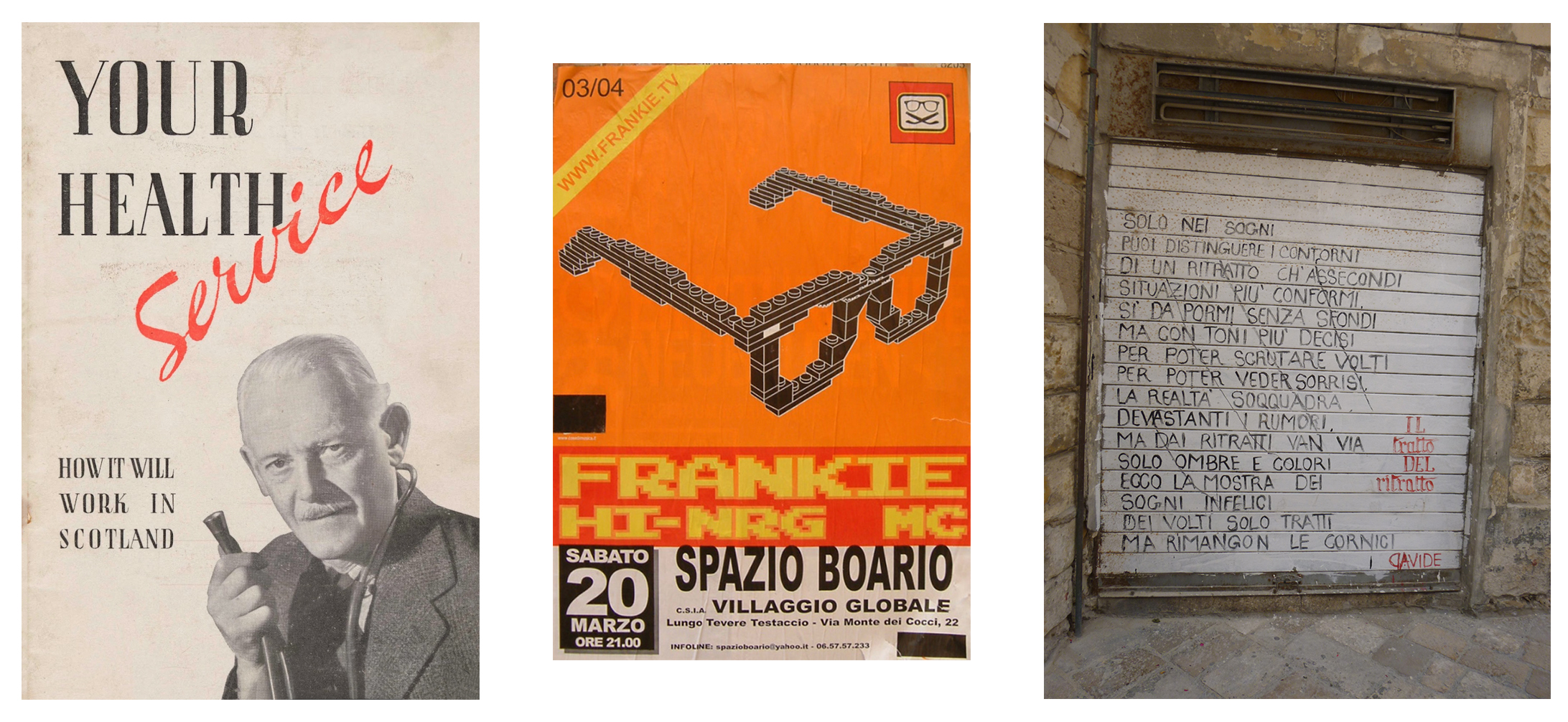
Left: “Your Health Service,” leaflet cover, British National Health Service, Anonymous, 1952; Center: “Frankie HI-NRG MC,” concert poster, Rome, Italy, 2004. Photo: Susan Yelavich; Right: “The Trait of the Portrait,” graffiti, Lecce, Italy, 2014. Photo: Susan Yelavich
‘Because’ can be a matter of history, e.g., a leaflet announcing the inauguration of the British National Health Service on July 5, 1948—the first universal health system available for all Britons and paid for by taxes. The leaflet’s cover projects assurance and economy via the image of the respectable doctor holding his stethoscope like a pipe. The only sign of the profound change that the NHS represented to British society appears in the upward angle of the red script spelling out “Service.” Seventy-five years later, the system of free health care is vulnerable in Britain—and still inconceivable in the U.S.
‘Because’ can be a matter of cultural convergences, here, music, branding, and technology, as it is in the eye-grabbing poster I photographed in Rome some years back. Frankie HI-NRG is a pioneering Italian hip-hop artist who began performing in the early 1990s. This poster for his concert in March 2004 plays with what it means to see through high and low-tech references by conflating the aliasing of pixels with Lego-like eyeglasses. It even coopts the Lego trademark in the upper right-hand corner. The anonymous designer’s use of staggered forms might also represent how the artist structures and builds his sounds.
When ‘because’ is added, value is added. And who’s not for added value?
‘Because’ can also be a literary matter, given graphic design’s symbiotic relationship to language, as witnessed by the poetic graffiti written in all caps on the metal door I photographed in Lecce. (The door is a larger version of the rolling window shutters typical in Italy). Loosely translated by me, it reads:
“THE TRAIT OF THE PORTRAIT” BY DAVIDE
ONLY IN DREAMS
CAN YOU DISTINGUISH THE CONTOURS
OF A PORTRAIT THAT PANDERS
TO MORE TYPICAL SITUATIONS
IT IS AS IF I AM PLACED WITHOUT A BACKGROUND
BUT WITH MORE DECISIVE TONES
TO BE ABLE TO SCRUTINIZE FACES
TO BE ABLE TO SEE SMILES
REALITY IS SCRAMBLED
DEVASTATING NOISES.
BUT FROM THE PORTRAITS
ONLY SHADOWS AND COLORS GO AWAY
HERE IS THE EXHIBITION OF
UNHAPPY DREAMS
OF THE FACES ONLY TRAITS
BUT THE FRAMES REMAIN
It matters, first, ‘because’ its horizontal bands echo the lined paper on which most poetry is written when it isn’t typed. Second, ‘because’ the poem, through the metaphor of a portrait, speaks to the problems in fixing a person’s identity—especially in southern Italy, a prime destination for refugees from the global south. Here, face is freed from image. Described only by the marks of letters and words, the ‘portrait.’ Thirdly, I submit it because, taken as an urban artifact, the situated poem converts a piece of infrastructure into a publisher.
No doubt, the strategy of ‘because’ (or, if you prefer, ‘as’ or ‘since’) may strike some readers as unnecessarily redundant. Shouldn’t the graphic image be trusted to speak for itself? Isn’t every submission essentially a work of communication? In the salad days of western modernism, that position was sacrosanct. The assumption was that since ‘we’ shared a visual language, translation was unnecessary. (Were ‘we’ ever so young? It seems so.)
[I]n claiming the moniker of ‘People’s,’ the Archive implicitly rejects the universal in favor of dispersal and discovery... [C]ommentaries will increase [the Archive’s] value now and ensure that [it] will hold meaning for future generations (who might otherwise be mystified by what they find).
However, in claiming the moniker of ‘People’s,’ the Archive implicitly rejects the universal in favor of dispersal and discovery. So, translations are vital to its work—translations that will sometimes be incomplete and, in some cases, contested. Regardless, their inclusion will confirm the PGDA’s fundamental pluralism. More expansive commentaries will increase its value now and ensure that the Archive will hold meaning for future generations (who might otherwise be mystified by what they find). Like any archive, this one is designed to be a living collection and a time capsule—one that tells good stories about what’s inside, and, just as importantly, what is and was on our minds.
Susan Yelavich is Professor Emerita, Design Studies, Parsons School of Design. She is a Fellow of the American Academy of Rome and the Bogliasco Foundation. Her most recent books are Thinking Design through Literature (2019) and Design as Future-Making (2014).