What Touch Makes Legible: Typographics 2026
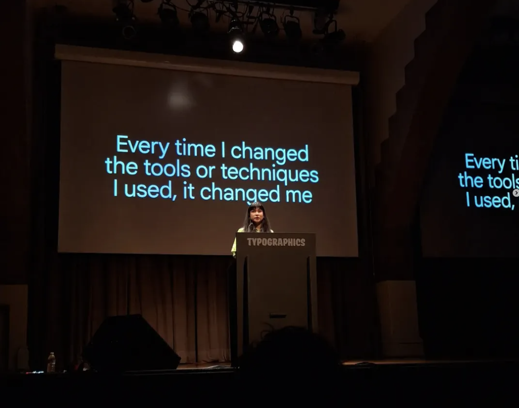
Khyati Trehan, “Designing the Doing” (presentation, Typographics 2026, The Cooper Union, New York, NY, June 27, 2026).
“Every time I changed the tools or techniques I used, it changed me,” designer Khyati Trehan said. In her talk, she described how she moves between traditional editorial design and an evolving approach to vibe coding, a process in which she becomes both designer and user, reacting to the tool even as she directs it.
This was my fourth time at Typographics, and every year I’m reminded of how much type can do. Across the talks, type emerged as a way of examining history, communication, power, memory, and culture. It may clarify or obscure, preserve or distort, signal belonging or exclusion. It holds multiple truths at once.
This year, one key idea was materiality. Many speakers focused on analog processes as a way of thinking. Using paper, ink, tape, cutouts, and hands-on experiments helped them slow down, make decisions visible, and stay in contact with the body before moving onto the screen.
Handcraft was not seen as rejecting technology, but as another kind of intelligence within it. Paper, ink, tape, cutouts, and hand-drawn forms became ways of thinking, introducing friction, accident, and touch before the screen could smooth the work into something too easy.
Trehan’s talk returned to this same spirit of experimentation from the digital side. “When stupid ideas work, they become genius ideas,” she said, making a case for play as serious part of the design process. Open-ended making can break the grip of linear thinking, giving the process enough room for stranger, more useful connections to surface.
Pop-up book designer and paper engineer Kelli Anderson gave language to this impulse. She quoted Hermann von Helmholtz, saying, “everything is an event of the skin.” We often imagine thought as separate from the body, as if ideas happen above us. But our nervous system reaches to the skin, and everything we know comes through our senses. Sound is air striking the eardrum. Reading is light meeting the retina. The body is the threshold through which the world becomes intelligible.
That matters now, as we navigate increasingly opaque systems, black-box technologies, and frictionless interfaces. The harder an interface is to understand, the more vulnerable we are to what controls it. In response, we want things that feel real and grounding. Some people say, “Make the logo bigger.” Anderson suggested something else: “Make the interface easier.” Make it something we can hold onto.
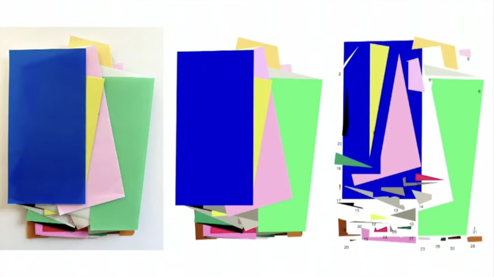
Anna Kulachek, “Typography as Image” (presentation, Typographics 2026, The Cooper Union, New York, NY, June 26, 2026).
Anna Kulachek also starts with hands-on materials and improvisation before using the computer. She arranges folded paper, colorful tapes, and screenprinted color studies, letting the design come together through touch, chance, and instinct. Only later does she move these experiments into the digital world and add type. For her, Louis Sullivan’s “form follows function” is reversed: function follows play, color follows instinct, and the computer simply follows.
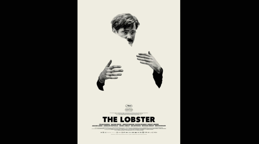
Vasilis Marmatakis, poster for Yorgos Lanthimos’s The Lobster, 2015. Shown during “Filmworks,” Typographics 2026, The Cooper Union, New York, NY, June 26, 2026.
Vasilis Marmatakis, known for his work with filmmaker Yorgos Lanthimos, also weaves handcraft through his process. To create grounding and depth, he inkjet printed type, used water to soften the edges, then scanned the changed letters back into the computer to finish the titles and credits. The digital image still shows the touch of the hand.
The poster for The Lobster makes absence feel physical. A man’s head and hands float on an off-white background, with his body erased into empty space. His arms reach for a hug that isn’t there, making absence the main image. The heavy black title anchors the poster with blunt force. Created with a physical cutout, the image uses visual absence to produce emotional absence. What is missing becomes the design.
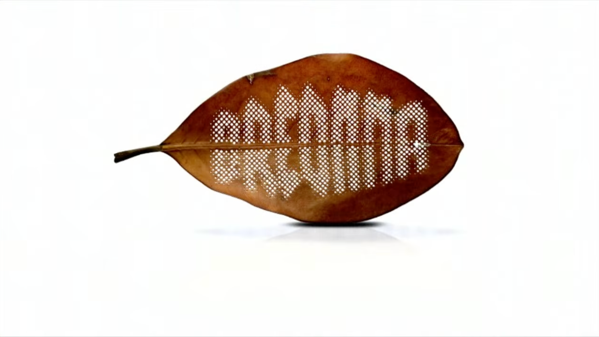
Nekisha Durrett, Magnolia | Breonna, from the Magnolia series, 2020–21. Shown during “Counter Spaces: The Shape of Memory and Absence,” Typographics 2026, The Cooper Union, New York, NY, June 26, 2026.
Nekisha Durrett moved us from the scale of the hand to the scale of mourning, memory, and public witness. She spoke about stamping the names of Black women killed by police brutality into magnolia leaves after noticing that the underside of the leaves matched the color of her skin. The gesture was quiet but devastating. A leaf became a surface for naming, a living material carrying the trace of a life taken by state violence. Because the names are punched through the leaves, the letters are also absences, small openings where material has been removed, echoing the lives taken from us. Her work makes typography feel tender, temporary, and impossible to ignore.
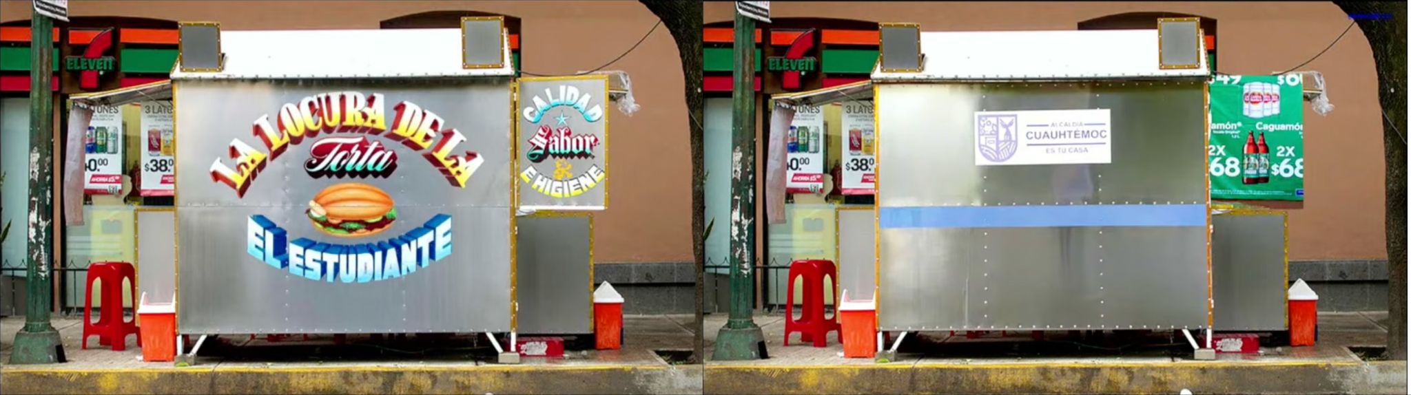
Abraham Lule, “Make Quality Tangible” (presentation, Typographics 2026, The Cooper Union, New York, NY, June 26, 2026).
Abraham Lule brought the focus back to the hand with sign painting, lettering, and the intentional imperfections of local graphic styles. His talk pushed back against the smoothness of digital design. In his work, quality is not just seen but felt in the uneven lines, the texture of paint, and the marks of human choice. While Durrett’s work asks how type can hold public memory, Lule’s asks how it can show everyday life. His lettering belongs to storefronts, packages, walls, and streets, places where type is not encountered as a file or a style, but as part of the texture of daily life.
The absence of the original hand-painted signage in the second photo reflects a 2022 order by the Cuauhtémoc borough government in Mexico City to paint over roughly 1,500 street food stall signs in the name of “order” and urban uniformity. The colorful rótulos were replaced with white paint and official borough branding, a move criticized by artists, designers, scholars, and residents as the erasure of a vernacular visual culture.
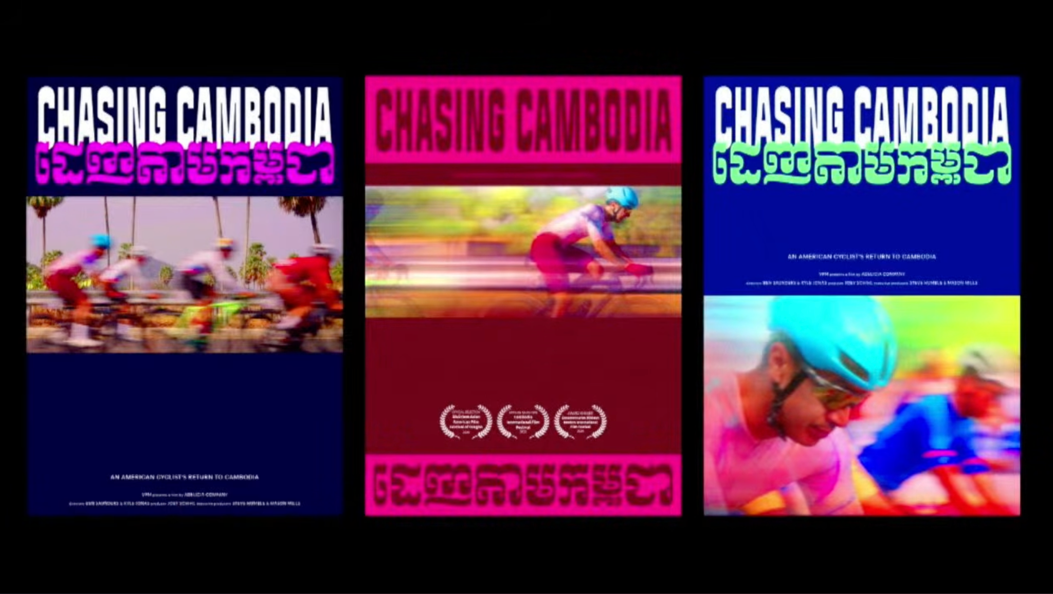
Tida Tep, “Mother Tongue: Confronting Identity through Type” (presentation, Typographics 2026, The Cooper Union, New York, NY, June 27, 2026).Tida Tep’s Chasing Cambodia posters, shown during her Typographics 2026 talk, visualized the process of confronting Khmer as both a typographic system and a language of inheritance. The poster design began with translating the documentary’s title into Khmer, with custom Khmer lettering by Fred Shallcrass inspired by Moul script, paired with Signal Compressed to evoke speed and cycling culture.
Tida Tep explored materiality through language itself. Her parents came from Cambodia, but she grew up unable to read or write Khmer, a distance that made the script feel at once intimate and inaccessible. Through work on a Khmer typeface, documentary branding, and restaurant branding rooted in Cambodian culture, she learned the language and its typographic rules with care. In the process, she began to see type as a place of inheritance, shame, pride, and healing. Her talk pointed to another kind of absence, not a missing body or monument, but a missing fluency. Khmer became a material she had to approach with study and humility, a script that held both distance and belonging.
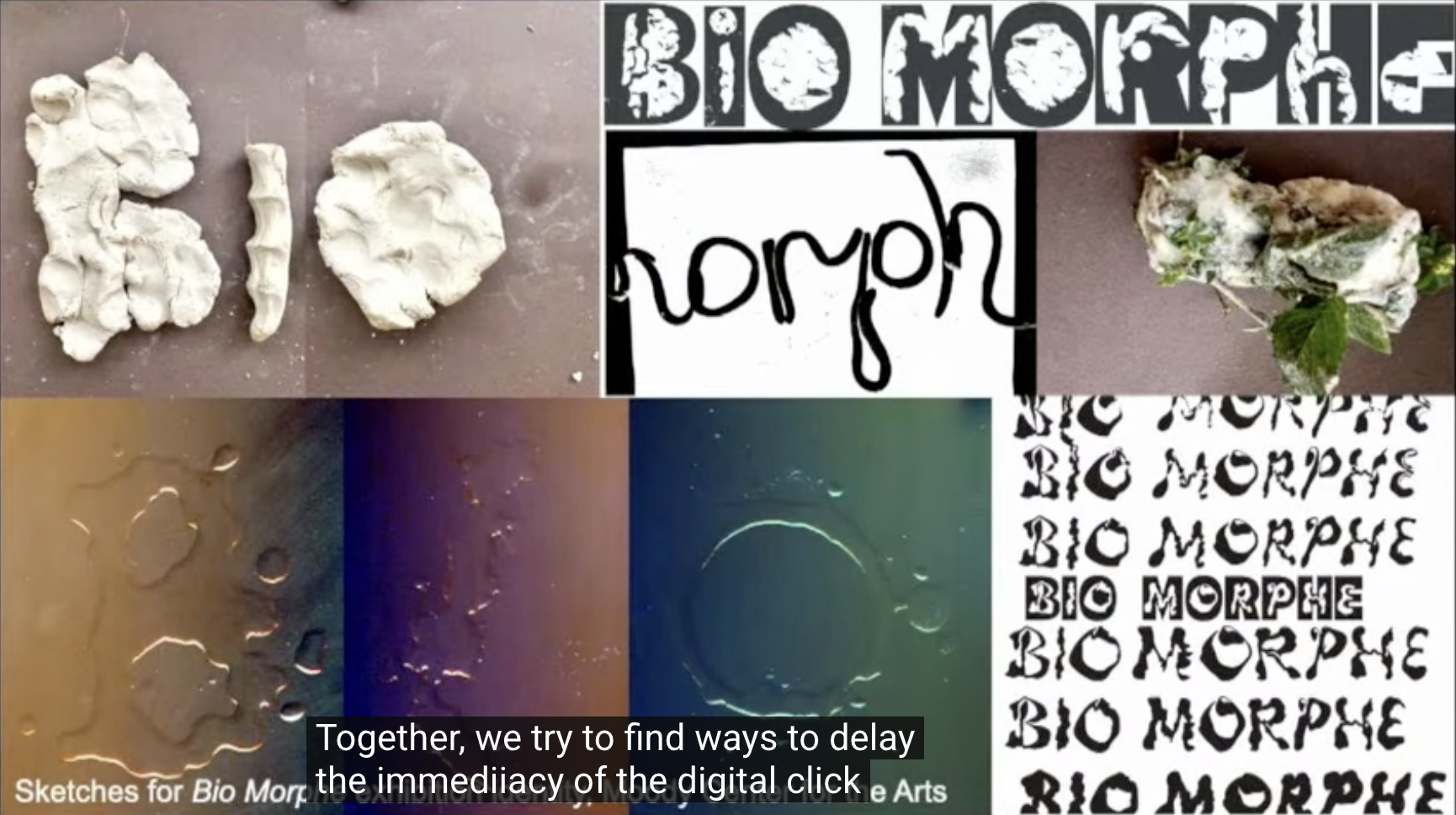
Sketches for Bio Morphe, exhibition identity, Moody Center for the Arts. Presented by Omnivore, Inc. during “SpellCheck: The Magic of Working Alone Together,” Typographics 2026, The Cooper Union, New York, NY, June 27, 2026.
Omnivore brought the conversation from individual making into collective practice. The design trio of working mothers, spread across Brooklyn, Los Angeles, and Portland, described having “worked alone together” for two decades through the portal of a computer. Motherhood, for them, is also a form of being alone together, shaped by care, interruption, porous boundaries, and the constant negotiation between making work and sustaining life. Handwork becomes a way to remember that labor is still craft, even on a keyboard. Their “practice of practice” delays “the immediacy of the digital click,” making room for friction, which they framed as the force that keeps things from sliding past each other. Friction creates contact and contact fosters connection. In their work, motherhood, typography, distance, care, and collaboration all become both-and conditions. Like a letterform, nothing exists without the space around it. Work, too, only exists when held by life.
What stayed with me was how often material process came up with questions of absence and memory. A cutout body, softened letterform, folded piece of paper, a painted sign, or a die-cut magnolia leaf. These were more than techniques. They showed what a system leaves out, what technology smooths over, and what a body still knows.
At Typographics this year, analog methods came back as a way to find direction. They let designers connect with their work before the interface took over, making meaning through resistance, friction, and play. Like the form and counterform around a letter, what was present and what was missing molded each other. Type, once again, held both.
Christa May {she/they} is a designer, researcher, and cultural worker based in Brooklyn, NY. The fundamental ethos that drives her two-decade-long practice is the mission to integrate design into conversations earlier to make objects and information accessible — working toward more socially just and ecologically sound systems.
Her MA thesis from the School of Visual Arts examined assisted reproductive technology through the lenses of design, political economy, and reproductive justice. She continues to build on that work through an ongoing research project on the commodification and privatization of fertility care.