Guest Curator Lawson Soward

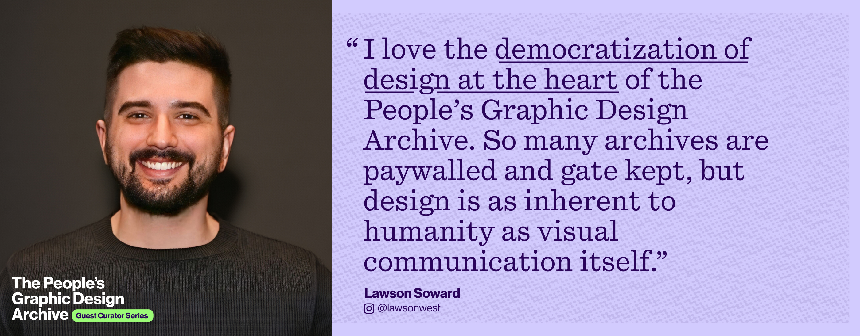
I love the democratization of design at the heart of the People’s Graphic Design Archive. So many archives are paywalled and gatekept, but design is as inherent to humanity as visual communication itself.

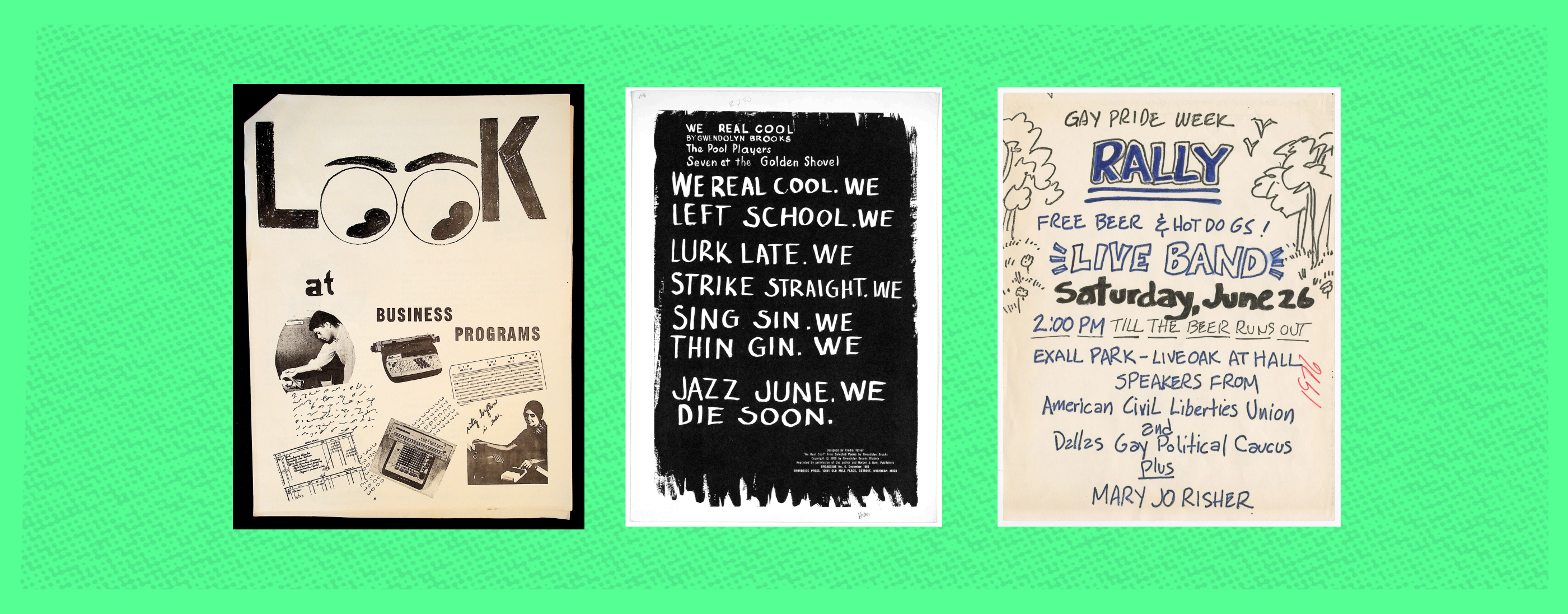
From left to right: Let's Be Snoopy and … (An independent publication (zine) about a business program.), “We real cool” (1966 Broadside No.6 of Broadside Press Broadside Series), and Dallas Gay Pride Week Rally Flyer (1976)
I love these pieces because of how effective they are. They don’t just communicate information, they communicate a uniquely human feeling and an inviting warmth. You can picture the hands that made them. Brand designs and ad campaigns today use handwritten type, analogue scanning, and hand-drawn illustrations like these as a deliberate style. I love using them in designs and seeing them in the wild. These particular works, however, were not commercial. They advocated for labor, advertised organizing around queer rights, and showcased the poetry of Black women. I don’t know if the specific people who made them had access to the same tools as “designers” of their day, but even in the likely scenario that they did not—they influenced design for decades into the present. As the saying goes, “It's a poor workman who blames his tools,” and American culture has been built into beauty by communities gatekept from tools at every turn.

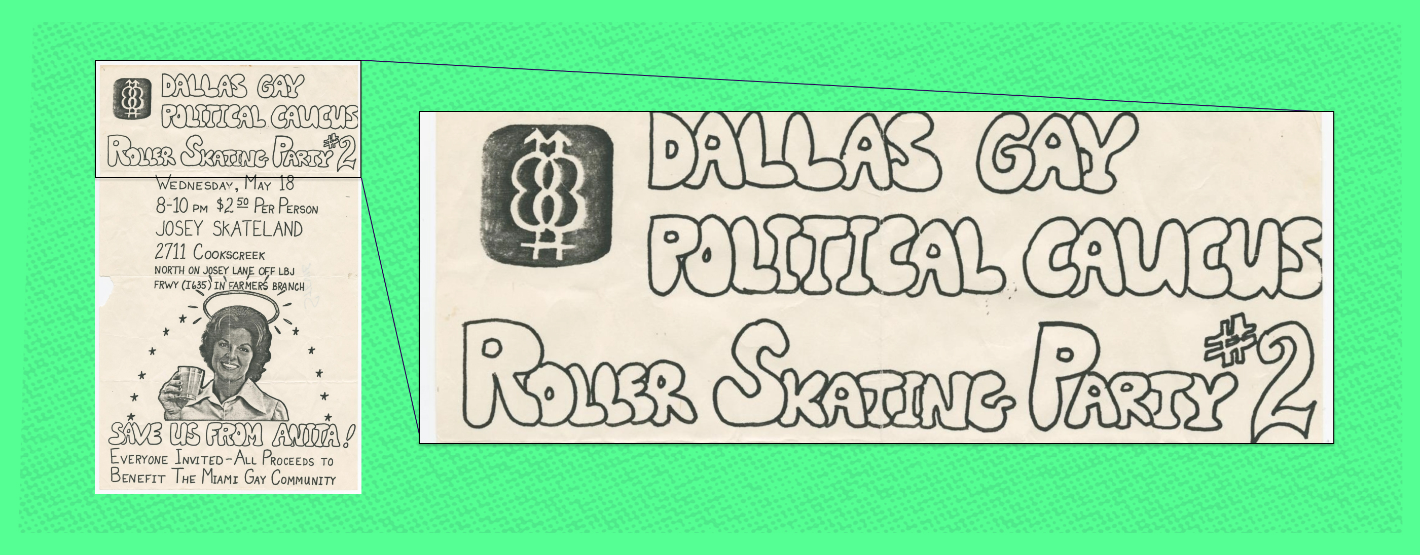
Dallas Gay Political Caucus Flyer | Flyer for a roller skating party hosted by the Dallas Gay Political Caucus on May 18th, 1977 to support the Miami Gay Community after public remarks by Anita Bryant, who was known at the time for her anti-gay statements.
It’s possible I just love these because I’m based in Chicago, was born and raised in Texas, and have always loved Peanuts. But I think there’s more to learn from these works than my personal history of holiday specials and geography. Yes, type, hierarchy, grids, color theory (and so much else) helps. But design is within reach of anyone with a marker and paper. On the days when a design is getting overcomplicated, it’s a good reminder of how few tools you need to make a design great.

Lawson's Picks
- “We real cool” (1966)
- Dallas Gay Pride Week Rally Flyer
- Dallas Gay Political Caucus Flyer
- Let's Be Snoopy and …
Follow Lawson on Instagram, Bluesky or at lawsonsoward.com