Guest Curator Ariana Vilchis
The Awkward Middle Child Before Digital Design Became the Norm
Ariana Vilchis is a freelance illustrator and designer based in Baltimore, Maryland. Here, she shares a few favorites from the Archive
As someone who grew up with digital tools for drawing, typesetting, and animating at my fingertips, it is hard to imagine how designers crafted their work before the digital boom. While the era of moveable type, Letraset, and similar technologies fascinates me, I want to spotlight the awkward middle child before digital design became the norm. The time when we were still figuring out how to use computers outside of the most elite technological environments and 4 gigabytes of RAM was something to celebrate. Welcome to the 1980s and 1990s.
Although I was not alive, much less designing at the time, I can peek into history using the Archive. The People’s Graphic Design Archive is a time machine that allows anyone with internet access and a computer to immerse themselves in the array of graphics, sketches, and printed ephemera from decades before. It saturates history with substance and reality. The Archive is a valuable tool for inspiration and contextualizing the narrative of graphic design.
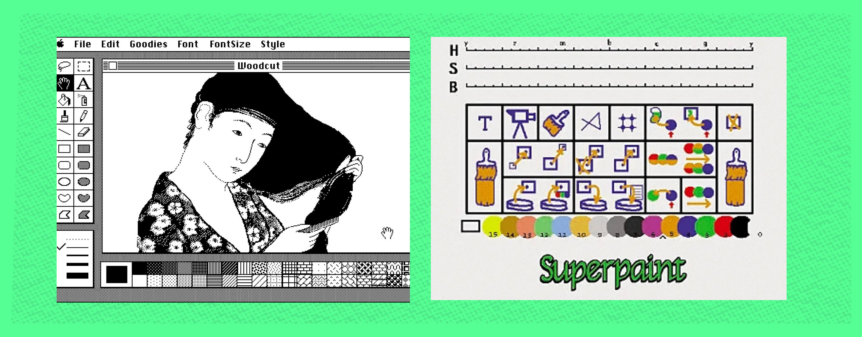
early digital interfaces and typefaces
Understanding Early Digital Design
To understand early digital design, we must investigate the software that not only created graphics but were themselves the works of pioneering designers. Early software had to communicate the function of each group of pixels (icons) and display the result live. So, software developers created MacPaint and SuperPaint. MacPaint was a revolutionary program that later became SuperPaint and was available on Macintosh computers as early as 1984. Their toolbars are simple yet remarkably similar to current software like Adobe Photoshop. They show identifiable tools like the text box, paint bucket, and brush. While these skeuomorphisms were simplified over five decades, their effectiveness has established them as essential in digital art software.
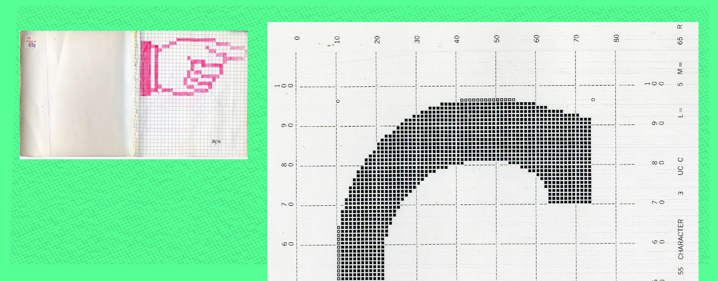
Susan Kare's early icon designs for Apple and Ladislas Mandel's test print for Lusitania Typeface
Who designed these iconic bits of imagery? Susan Kare is responsible for many of the classic icons that Apple used. The dimensions of early personal computers maxed out at a few hundred pixels. Her icon sketches for an interview at Apple exemplify the thought process of a designer working within that small grid. She succeeded at representing countless actions and meanings with her bitmap drawings. I wonder how she figured it out. A day will come when designers must once again deconstruct a new technology to produce more symbols and ways to communicate with the world.
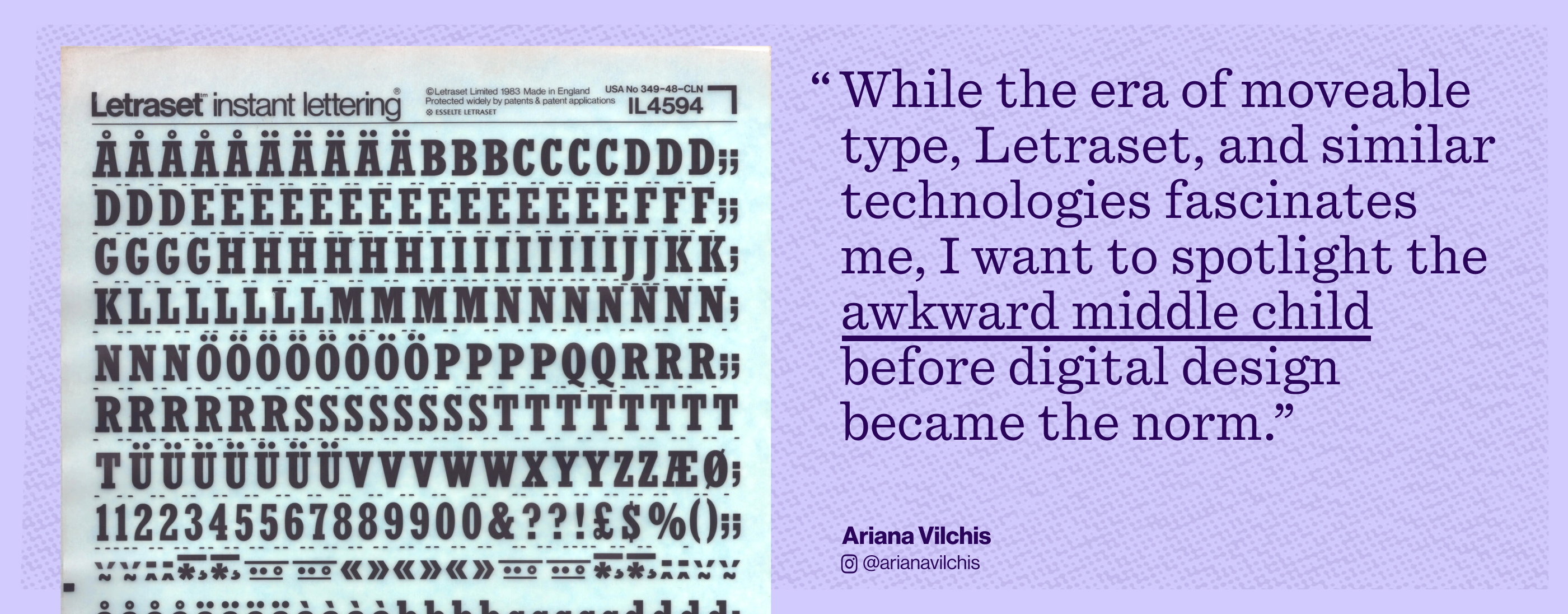
Letraset Lettering sheet
Pixels Are Precious
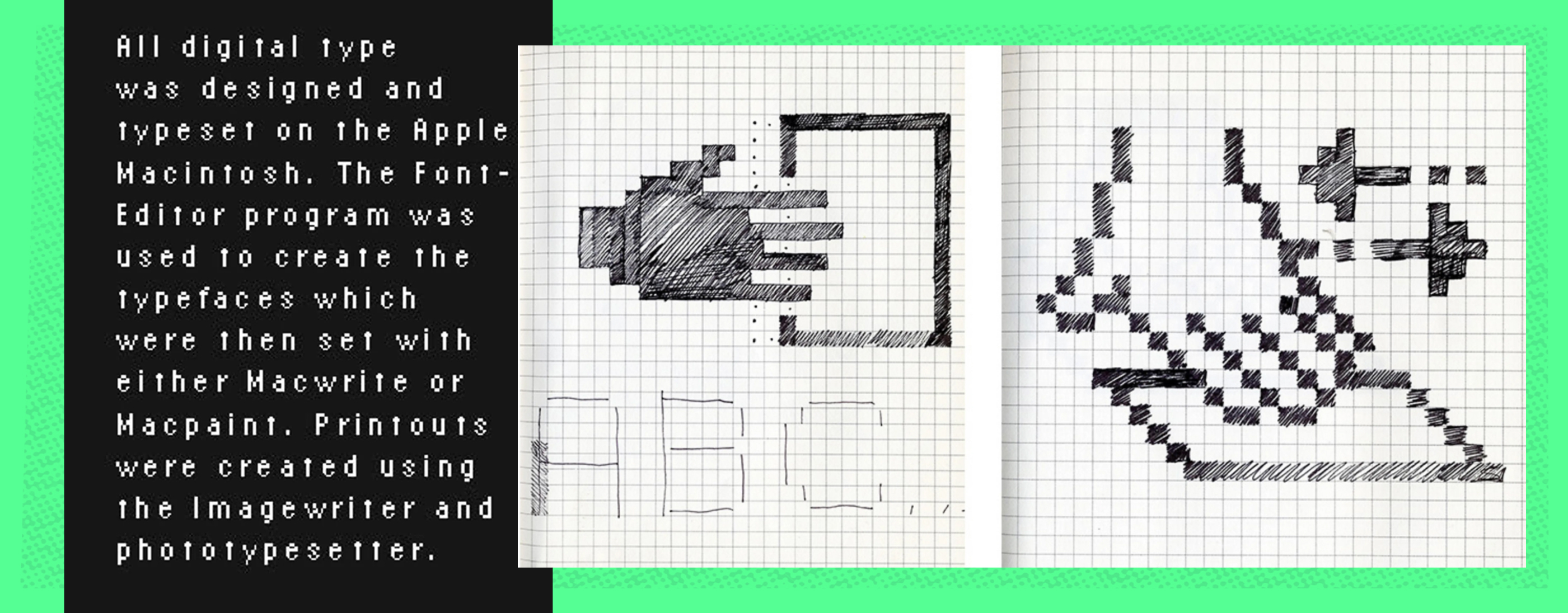
One of the primary ways we communicate is through writing. Graphic designers create the vehicles for this correspondence: fonts. Pixels are the Legos for building fonts on computers. These early bitmap fonts follow the same visual principles as icons, confined to the grid. The printed-out lowercase “c” of the Lusitania typeface is a terrific example of early font design. Each pixel is precious and is the difference between a smooth curve and a clumsy angle. Sometimes, designers printed paragraphs of text and the amount of pixels per letter diminished. The early digital type ad for Apple Macintosh showcases a pixelated paragraph of text. Yet, it is legible. Nowadays, pixelated fonts are used not out of necessity but to make an aesthetic statement. They pay homage to an early digital design era.
All together, these images provide an in-depth look into the minds of designers and how their technological restrictions were the catalysts for creativity. This period must have been confusing and exciting all at once.
The Evolution of Technology
Technology today is a far cry from what it was then. Now, laptops and the user-friendly interfaces of design software make graphic design more accessible than ever. We have terabytes of storage and four times as much RAM as they did back then. I am a passionate advocate for accessible technology despite potential drawbacks. The rise of Artificial Intelligence in every aspect of design can be empowering yet daunting. Theft is not new to the art world. However, AI automates and augments it in a way that frightens me. It is up to us as designers to get through this digital growth spurt with the same conviction that early digital designers did with the new world of computers staring them in the face. The Archive is once again a tool for documentation and reality. I am forever grateful to the extensive library with proof of our creative processes and finished work.
View Ariana's selections in The Archive:
Superpaint! The First Digital Art Program by Richard Shoup, 1972
MacPaint interface for Macintosh by Susan Kare, 1983
Icons for an Interview at Apple by Susan Kare, 1982
Lusitania, lowercase ‘c’, hard copy bitmap output by Vladislav Mandel, 1986
Early digital type ad by Zuzana Licko
