Guest Curator Andrea Yepes
Five Favorites from the Archive
Andrea Yepes is a design journalist based in Envigado, Colombia. Here, she shares five favorites from the Archive and perspectives about Graphic Design history.
Archives have the amazing characteristic of making us feel accompanied, a feeling that is built by many people, not only experts. It is like a constant conversation with others and a place to understand different perceptions and aesthetic pursuits. Below are five of my favorites from The People's Graphic Design Archive.
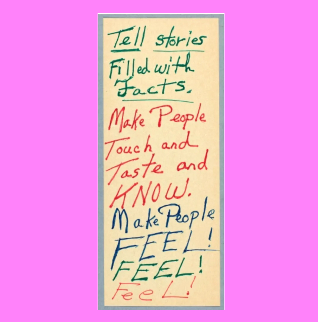
Sketch by Octavia Butler, "Notes on Writing"
I love handwriting and I think that with different colors, changes between lowercase and uppercase letters and a good handling of the sheet of paper you can create and communicate. That’s the way I explore letters and layout as a non-designer who loves design, just by grabbing a pen and paper.
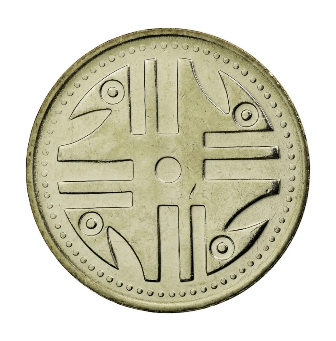
200 pesos coin designed by Dicken Castro, 1994 for the Banco de la República, Colombia, Bogota
I was really surprised when I saw this coin in the archive because I agree that it is a really important design piece from Colombia. These were designed by Dicken Castro and the state chose these designs in a contest but he is one of the most important architects and designers in local history. He design a lot of logotypes from important and public establishments and he was very fond of popular culture and pre Columbian art and you can tell that in the 200 pesos coin. The figure is inspired by Quimbaya culture.
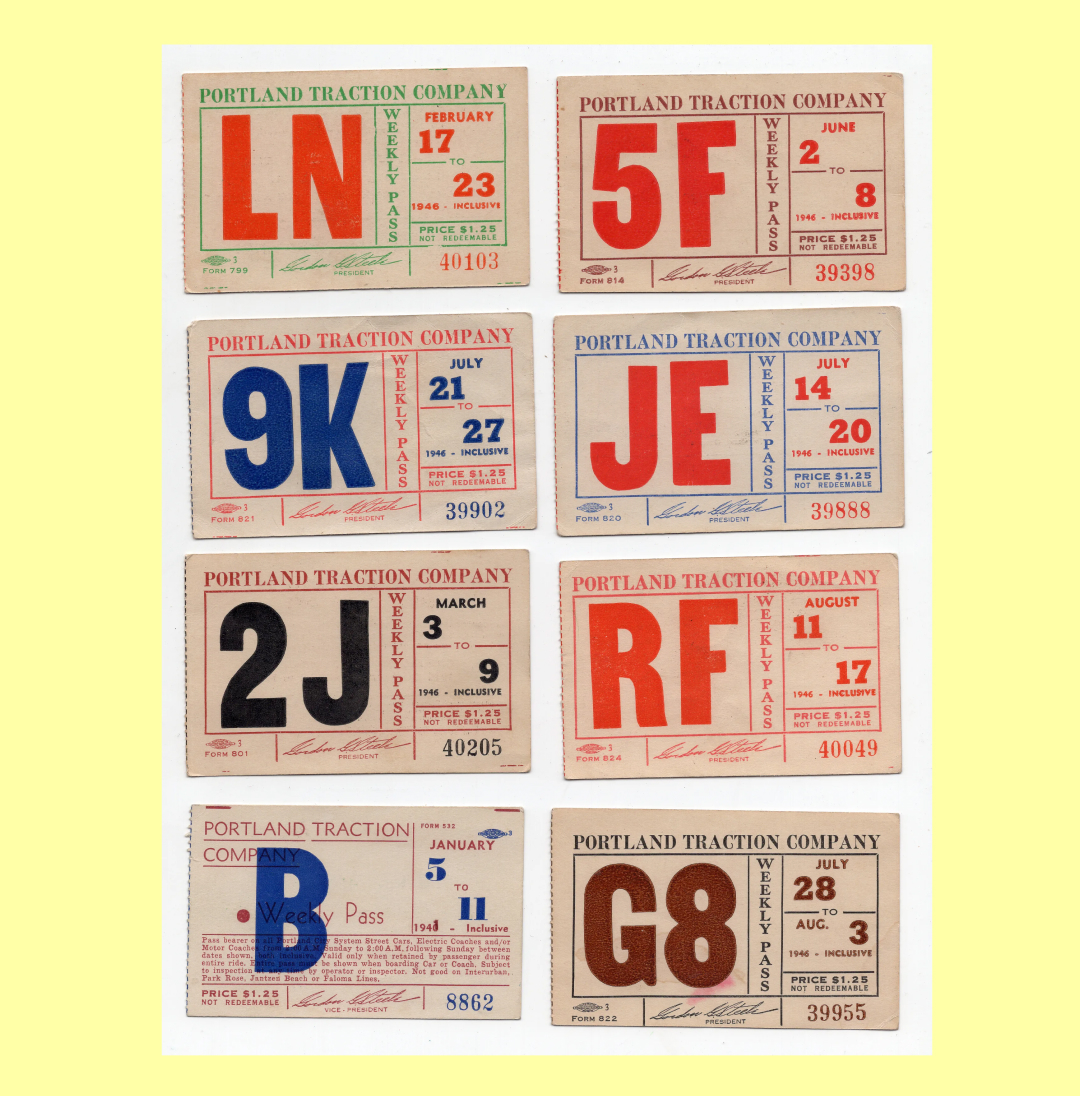
Portland transportation tickets, 1946
I chose this one because I think that the most important thing about graphic design history and the collection of material is for people to realize that it is in everyday things that you make a real impact. Is not always the poster of that important band or that logo of a big company, the real history is in the train map, in the theater brochure, or in this case, in the traction company tickets from Portland from 1946.
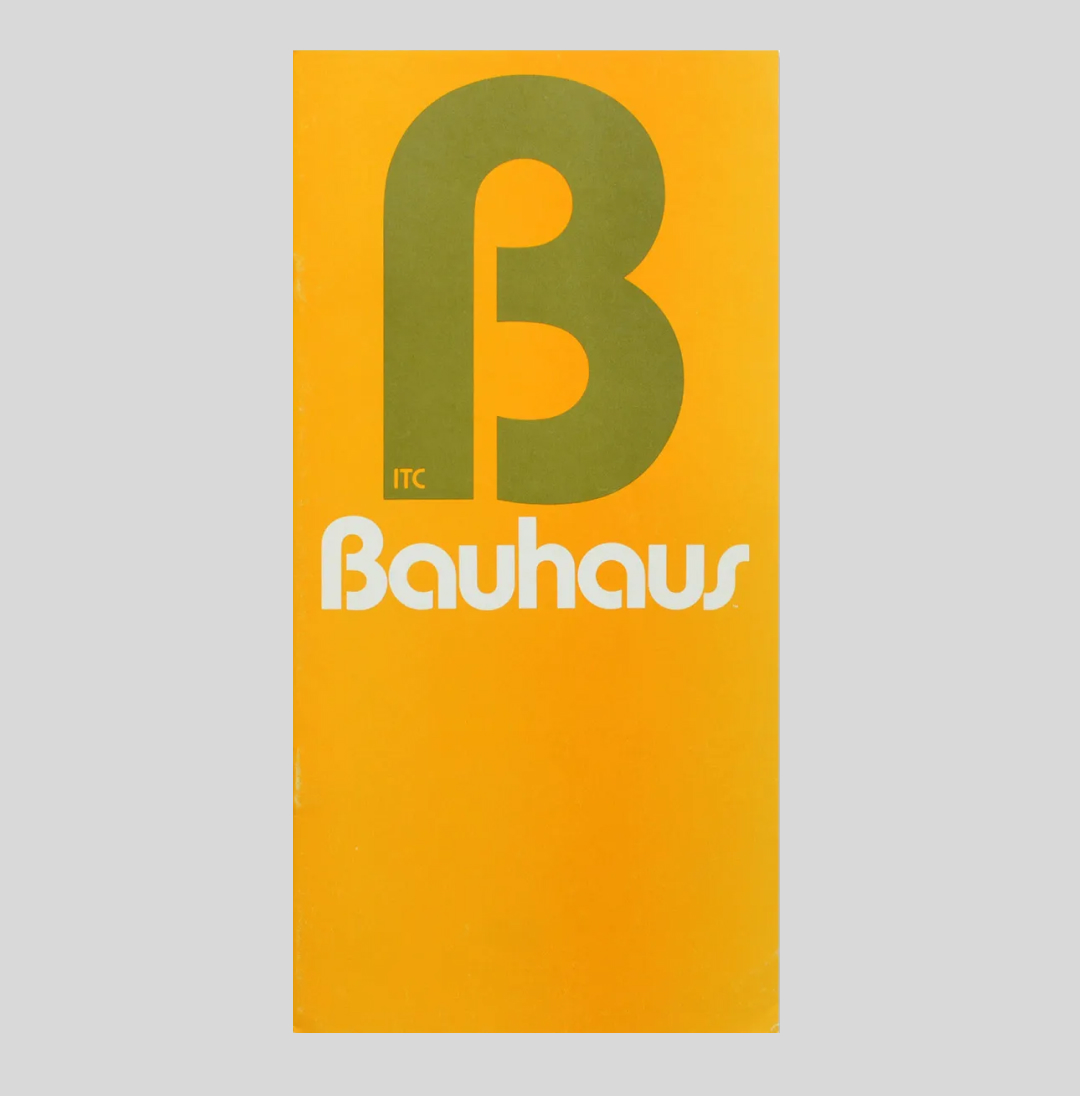
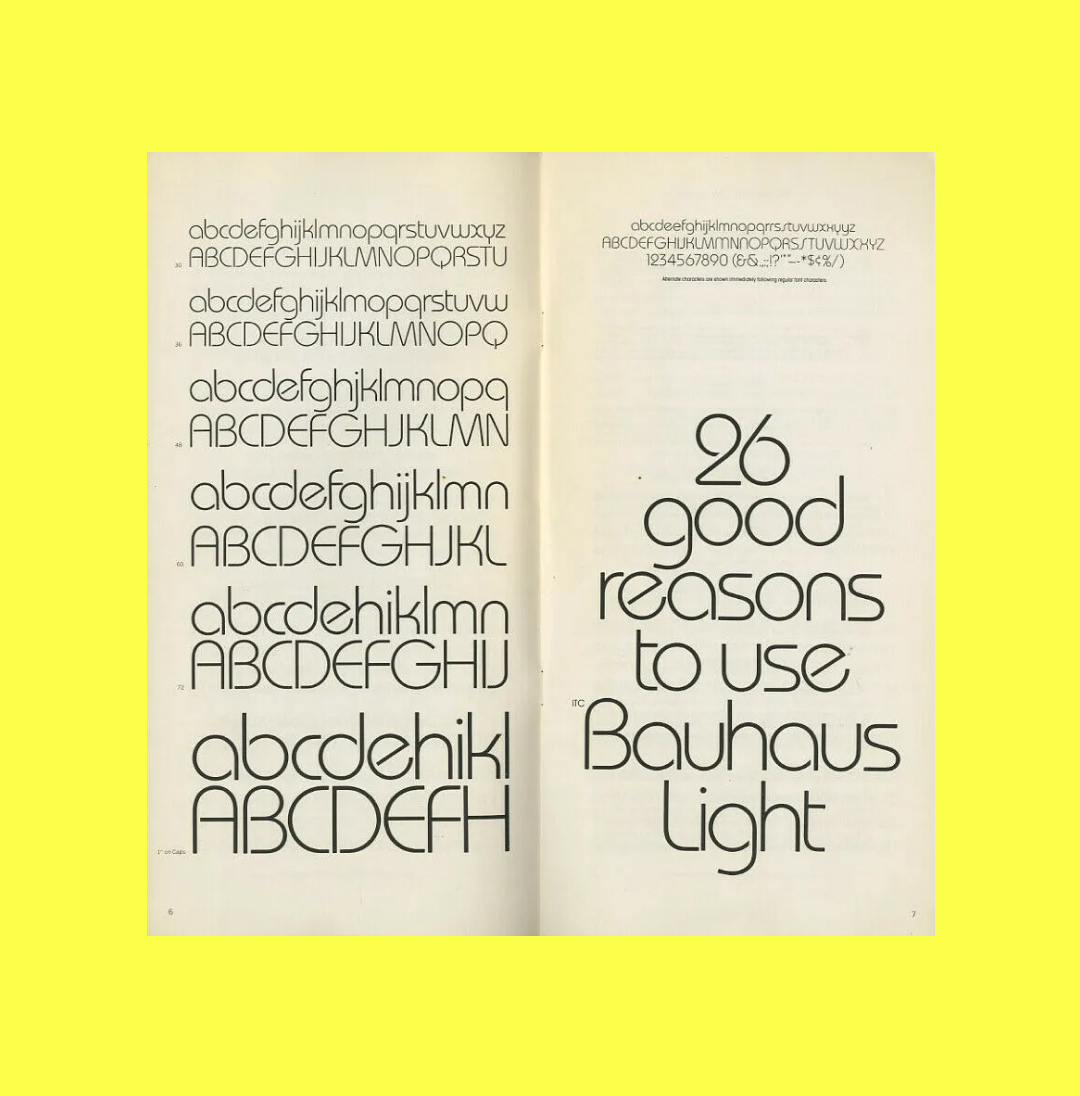
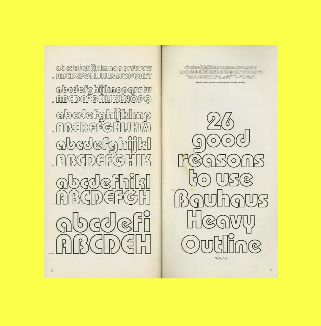
Bauhaus Typeface Specimen by Ed Benguiat and Vic Caruso for International Typeface Corporation, 1976
I am always amazed by this typeface when it appears because it is so precise. It actually is what it meant to be: a tribute to Herbert Bayer’s Universal typeface and synthesis of Bauhaus aesthetic in general. Is a geometric typeface but sans serif and with really wide experimentation with round forms. I think in these characters we can find the simplistic, democratic and functional ideology of Bauhaus.
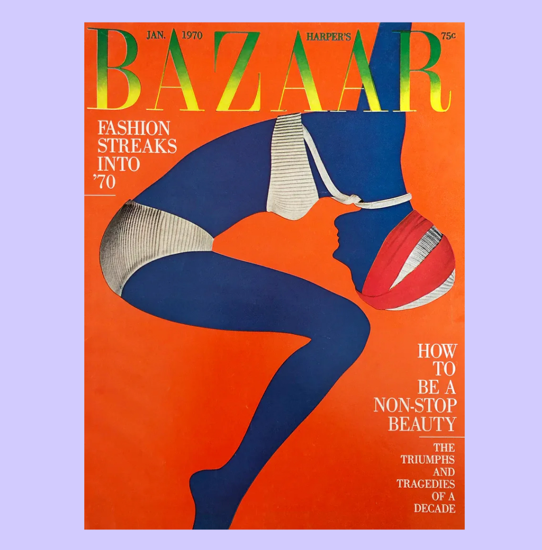
Harper’s Bazaar cover by Bea Feitler and Ruth Ansel from January 1970
I think an archive's purpose is also to make us realize that somewhere along the way something was changed and perhaps it lost some magic. I felt nostalgic when looking at this cover from Harper’s Bazaar that is so colorful and risky. I wasn’t alive in the 70’s but my entrance to design was fashion and especially magazines. I remember studying fashion history and feel inspired by covers like Diana Vreeland’s for Vogue and Harper’s or anything from Peter Lindbergh. In these days the feeling that comes from observing a wonderful fashion image does not come so often.

Design Impacts Everyday Life
I think that countries like mine (Colombia) have a necessity to write the story of the objects and the graphics that grew around us. We have been so busy with internal war and local violence that sometimes design has a more niche treatment so people don’t realize that design impacts their everyday life and that we need it for the city and the society to work. So I hope that Latin American countries find in this kind of initiative a push to share their images and their visual history.
